Personality and Brand for Centerville
illustration
10/24/2022

Summary
Reflecting on my time at Planning Center, I am reminded of the transformative journey I embarked on while creating an asset library for illustrations. This endeavor brought about a paradigm shift in our design process, elevating our brand's visual language and fostering deeper connections with our audience.
Idea
During my time at Planning Center, I embarked on quite the journey. I took it upon myself to create an illustration library, and trust me, it was a game changer for our design philosophy. This initiative took our brand's visual storytelling to new heights and genuinely deepened our bond with the audience.
For those who might not know, I was the point person for crafting images for the Planning Center blog posts. Producing unique imagery for each article was no small task. Identifying the inefficiency, I championed the creation of this asset library, even when it wasn't the most popular idea on the table.
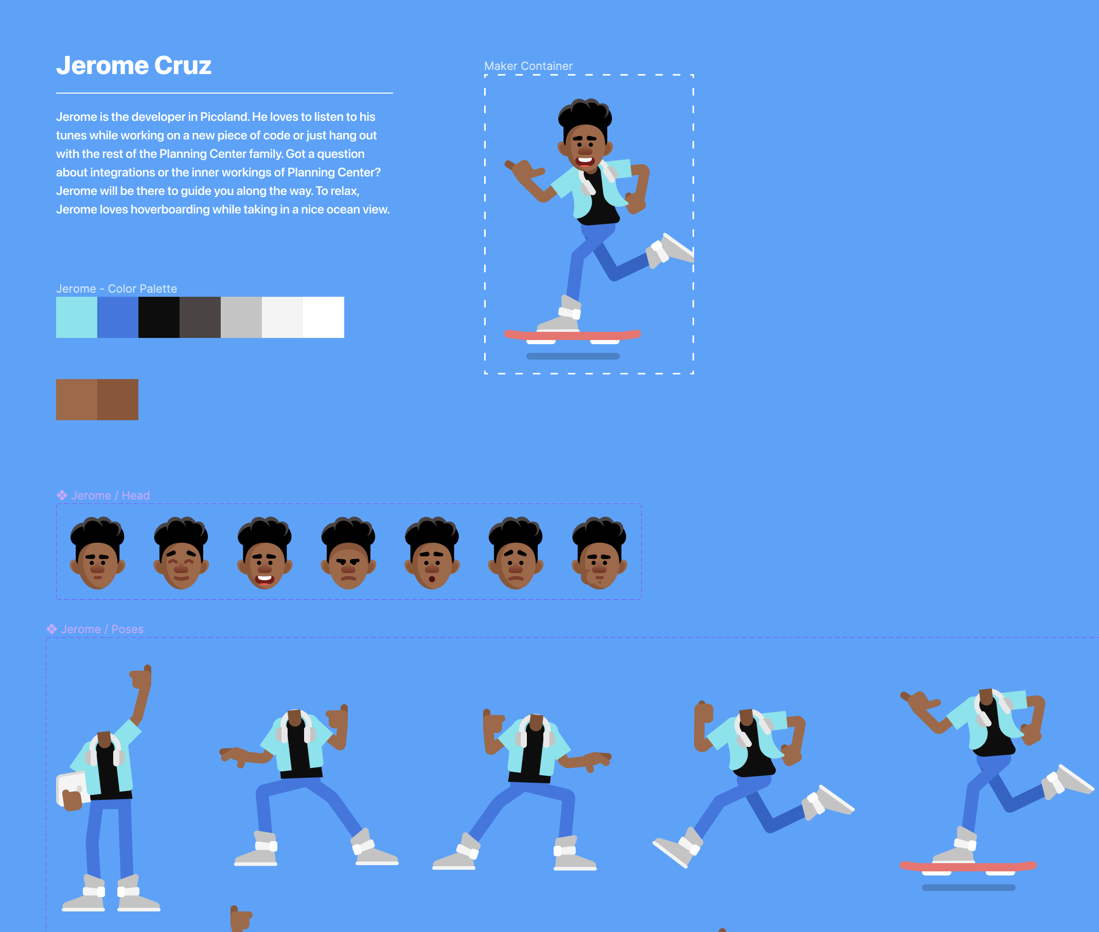
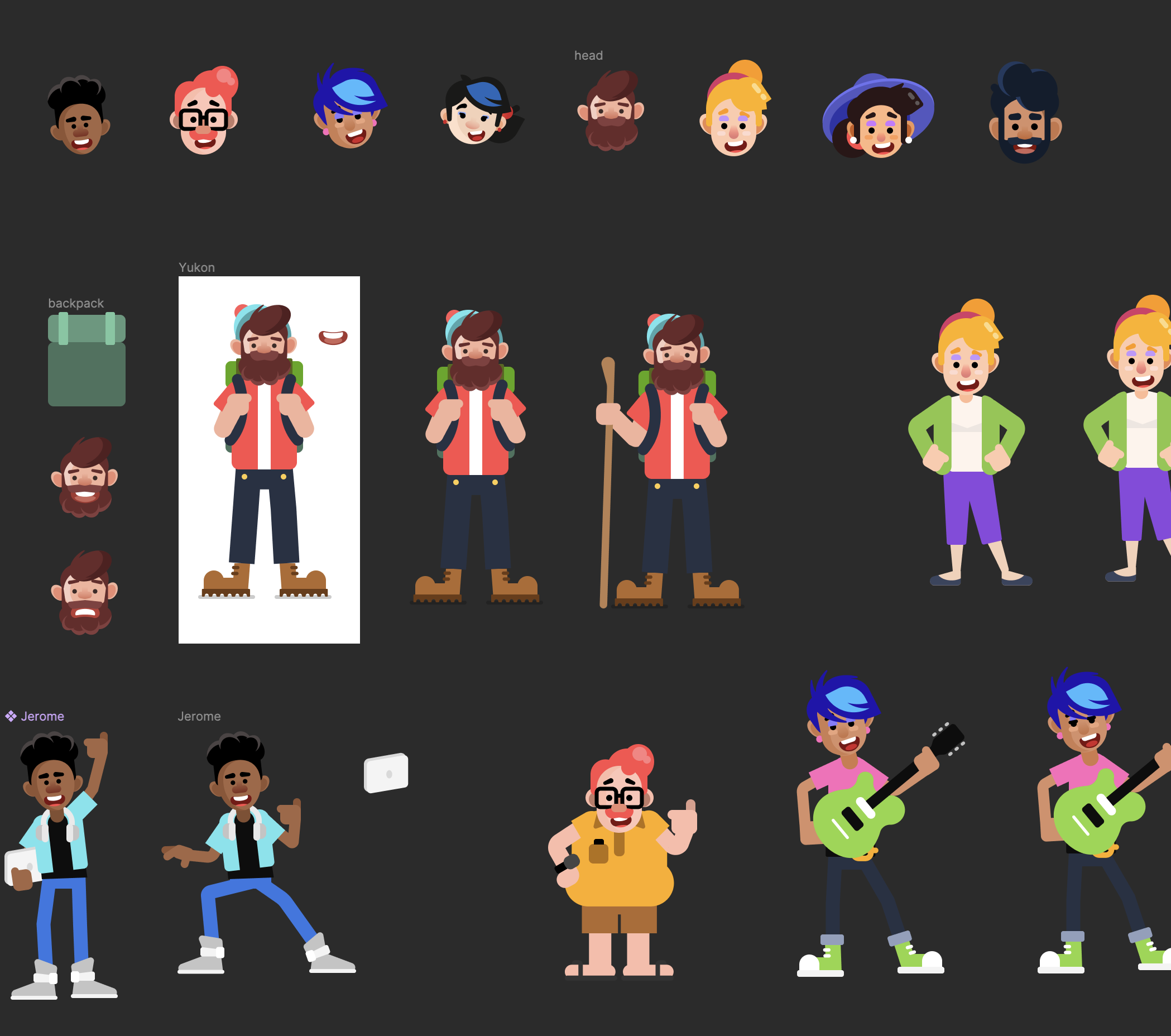
 Then came one of the most exciting parts: developing characters. There's real magic in characters—they breathe life and emotion into a brand. But, it's a delicate dance. Drawing cues from the iconic characters in Duolingo, I endeavored to give Planning Center's characters their own individual flair and charisma. While my time ended before seeing the full realization of this vision, the groundwork was firmly laid.
Centerville
Inspired by Duolingo's world, I conceptualized a virtual space named "Centerville" for our characters. A place where users could interact with our content in an immersive setting. To my delight, even after I moved on, Planning Center continued to develop Centerville, and the feedback has been overwhelmingly positive.

 But there's more to the story than just characters. The illustration library also became home to a suite of user interface (UI) designs. These aren't just for show—they offer a tantalizing preview of our product without diving into detailed screenshots. Much like a captivating trailer for a new film, our product's marketing site was crafted to serve as an enticing introduction to the larger world we’ve built.
 In summing up, my mission at Planning Center was clear: to establish a rich and diverse illustration library. By combining versatile assets, memorable characters, and elegant UI components, I envisioned a brand experience that was not only efficient but deeply engaging. And from what I've seen, this strategy has resonated deeply with our community.