MultiSig Labs - Branding & Site Design
case studies
10/16/2023

Check out the final site at multisiglabs.org
Capturing lighting in a bottle
I've been exploring some new approaches to brand design. Usually, I fixate on the logo and color scheme a first but this time I decided to work backwards a bit and start with the weblayout. There are so many sources of inspiration out there and one that I often look at and wish that I could use is from Mike at Creative Mints. His work is all over dribbble if you are interested. I highly recommend checking it out.
Although I have seen a ton of his work as far as static design goes, I have never seen it implemented so I would love to check that out at some point. Either way, I decided to borrow some approaches from him and others in this exploration of creating a brand for Multisig Labs, Inc.
Ultimately, we wanted to go for something very simple and familiar without spending a ton of overhead on it.
Concepts
Web Comps
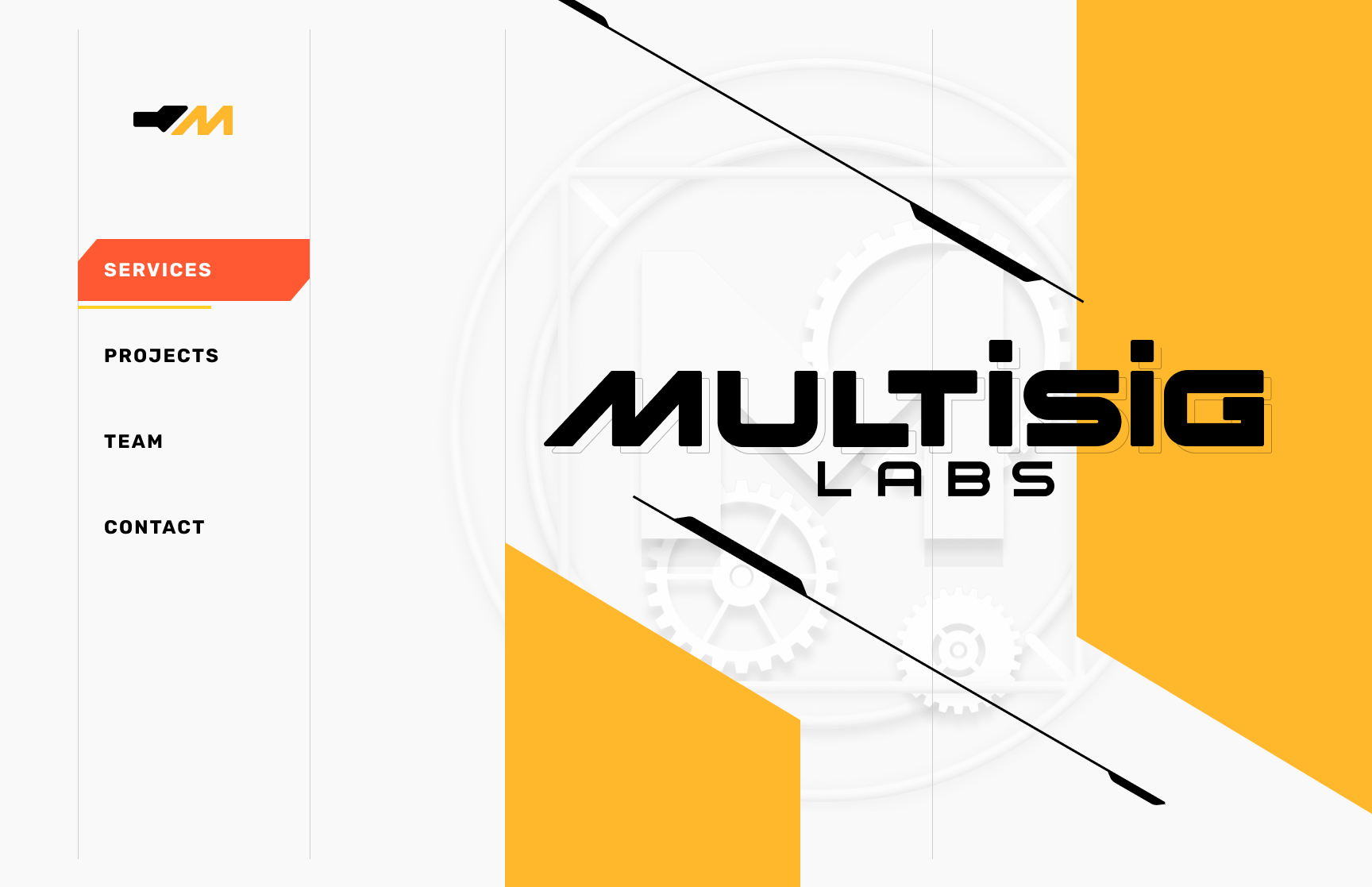
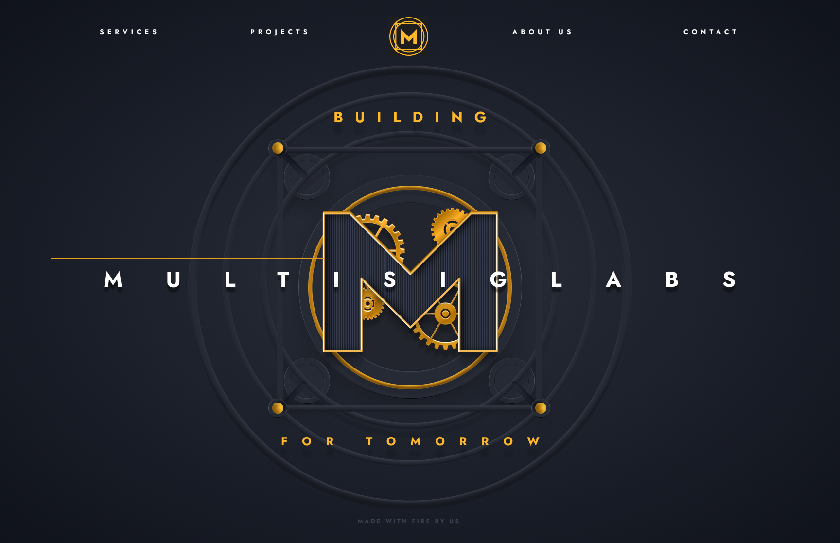
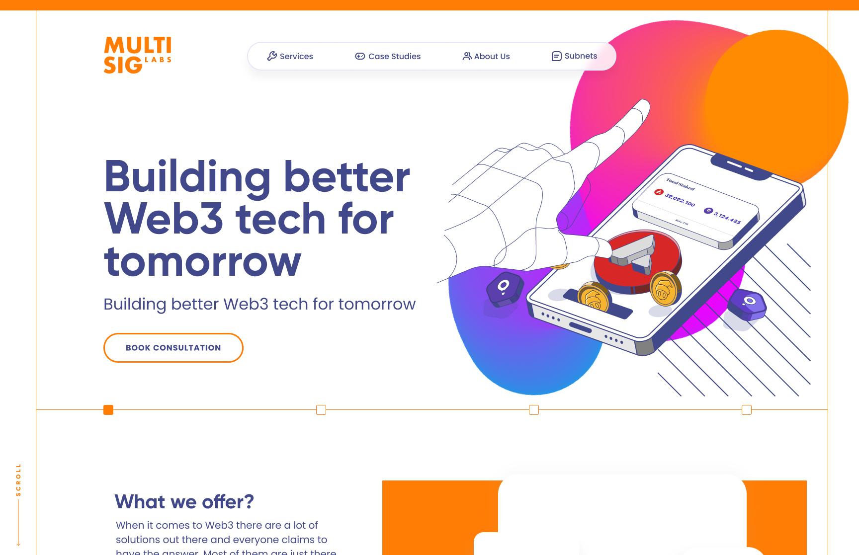
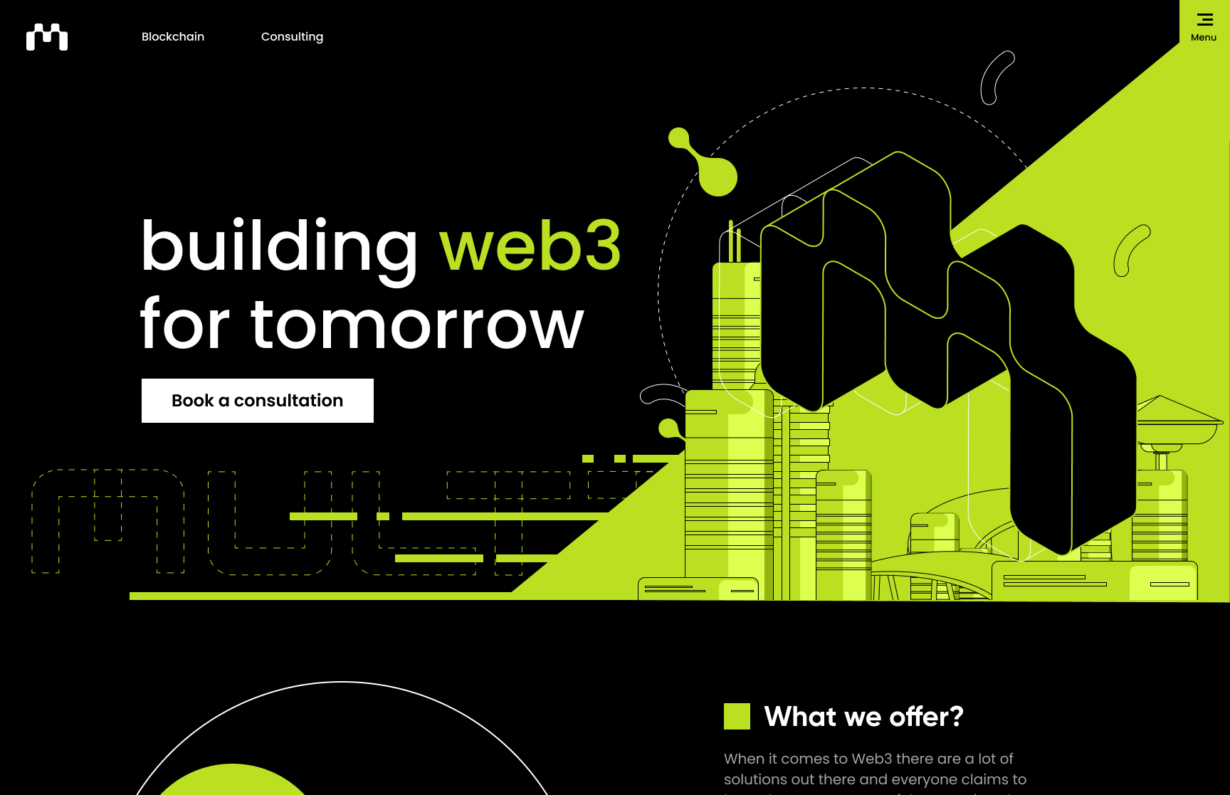
Keep it simple
After doing these more in-depth and detailed designs, we decided to change course a bit and go for something a lot more simplified. We wanted the brand to feel approachable and yet something that you could see featured in a tech article that would sort of blend in with the other more prominent applications and products out there.

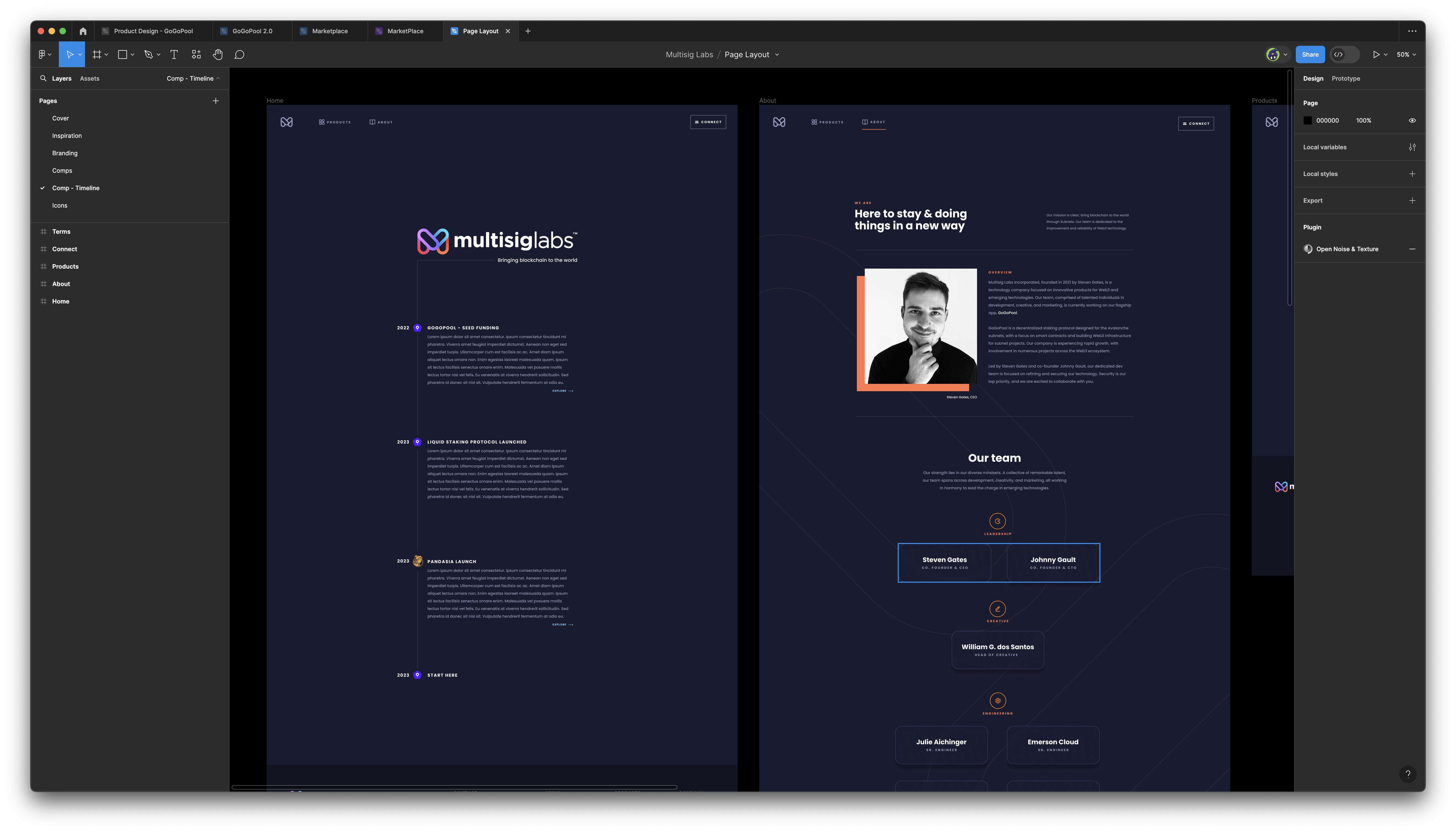
Implementation
I didn't want to dedicate a ton of time to this project so I quickly implemented it with NextJS and wrote a bunch of really hacky CSS that is not my finest work but it does the job. You can view the site at multisiglabs.org