Planning Center - Marketing Site 1
case studies
05/16/2020

Research
We've been running with the same layouts at Planning Center for our marketing for a few years and I've been exploring some possible updates. The goal is to showcase the UI of our products through dynamic imagery and can and should be interactive. Simplfied UI will help sell the idea of the ease of use when it comes to our products. My thought on this stems from test driving cars and "getting a feel" for it.
These layouts are more skeleton structures than full comps but the idea is there for our team to discuss and analyze.
Audits
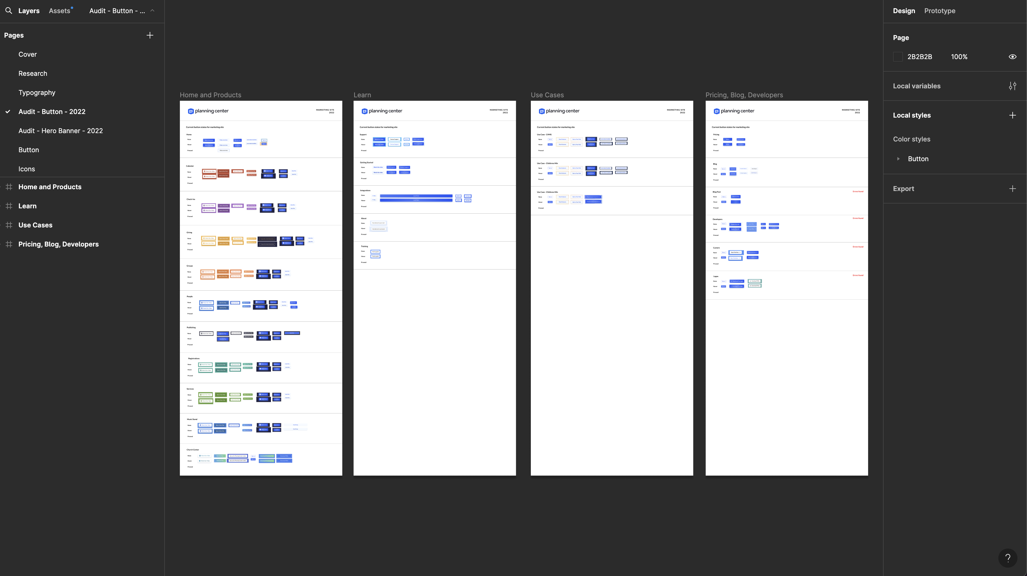
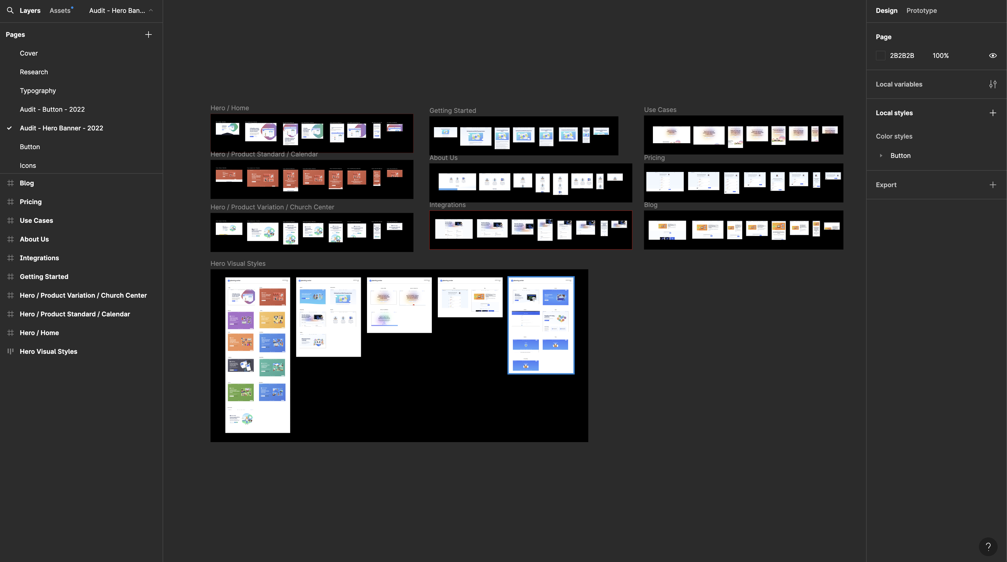
First, I needed to run through all of the existing site pages and catalog the differences and similarities between them. This was a bit of a daunting process but well worth it in the end so we could avoid further duplication of both UI elements and CSS classes.
Working on typography
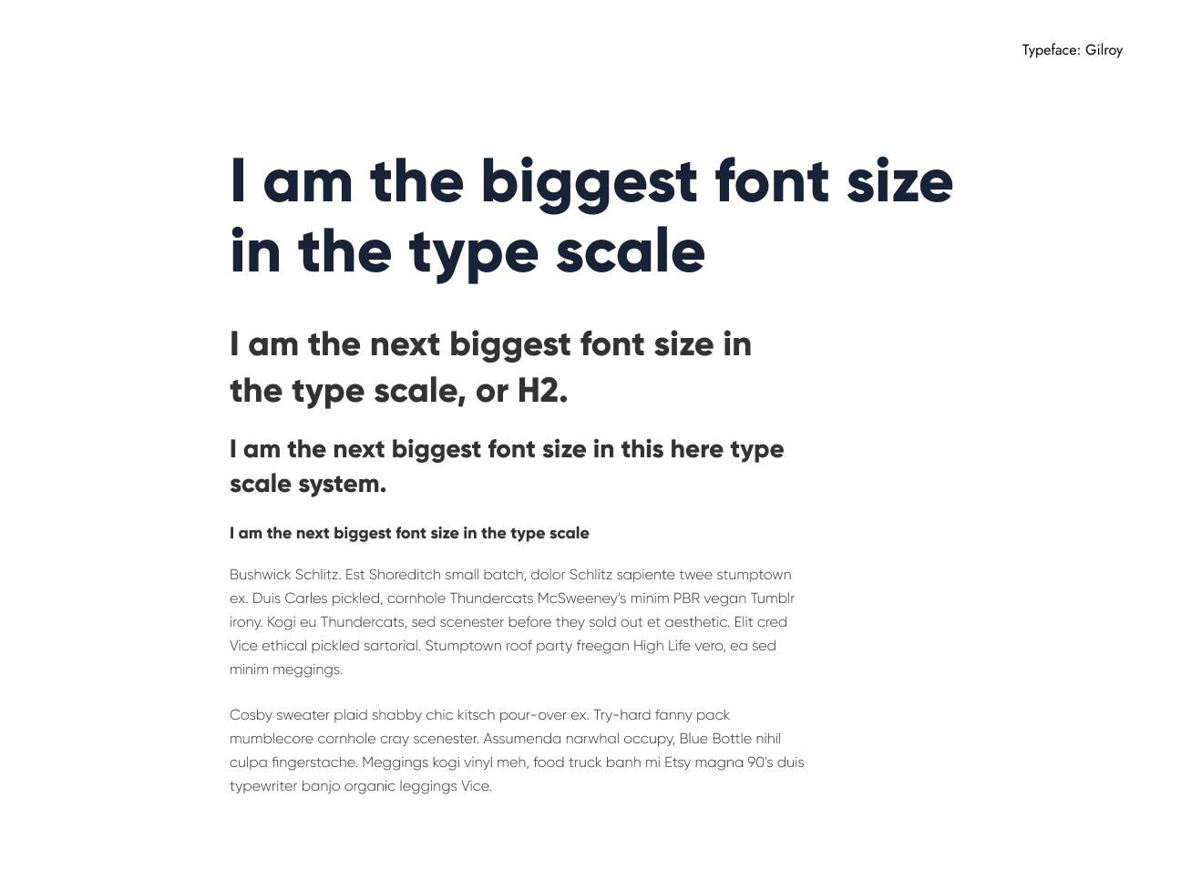
We tried out a few different type faces but the one that we landed on, and my personal favorite, was Gilroy. It seems to have the most appropriate weights and typographic treatment that mathces closely with the custom font for the Planning Center branding.
Buttons
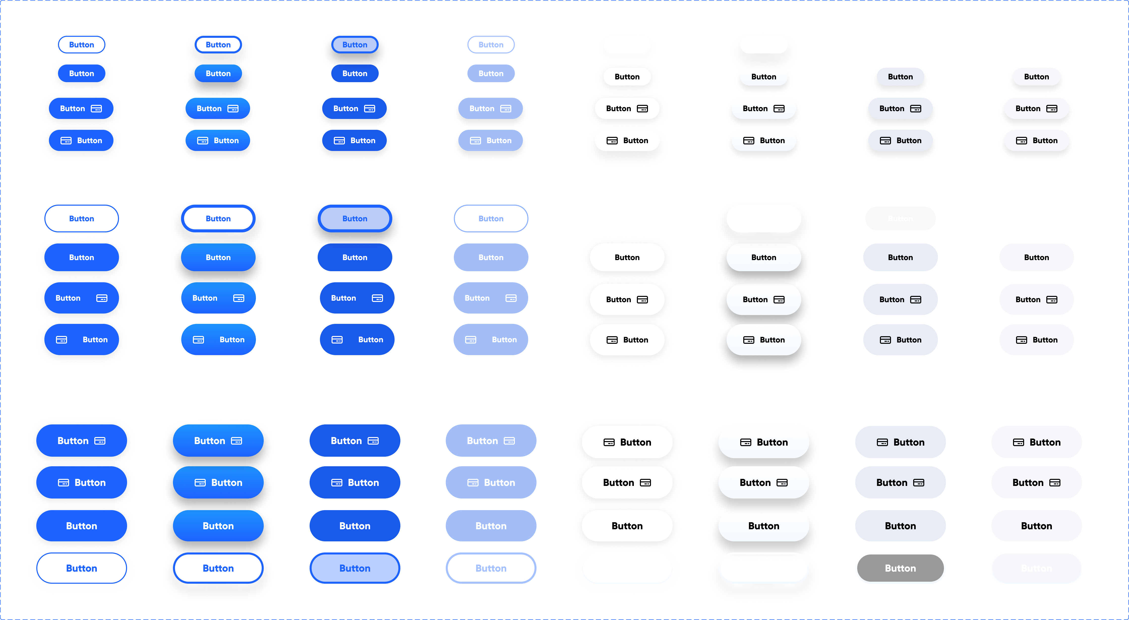
There were a variety of button styles on our old marketing site that I have auditted. The new shape is more consistent now with the rest of our products.
Comps
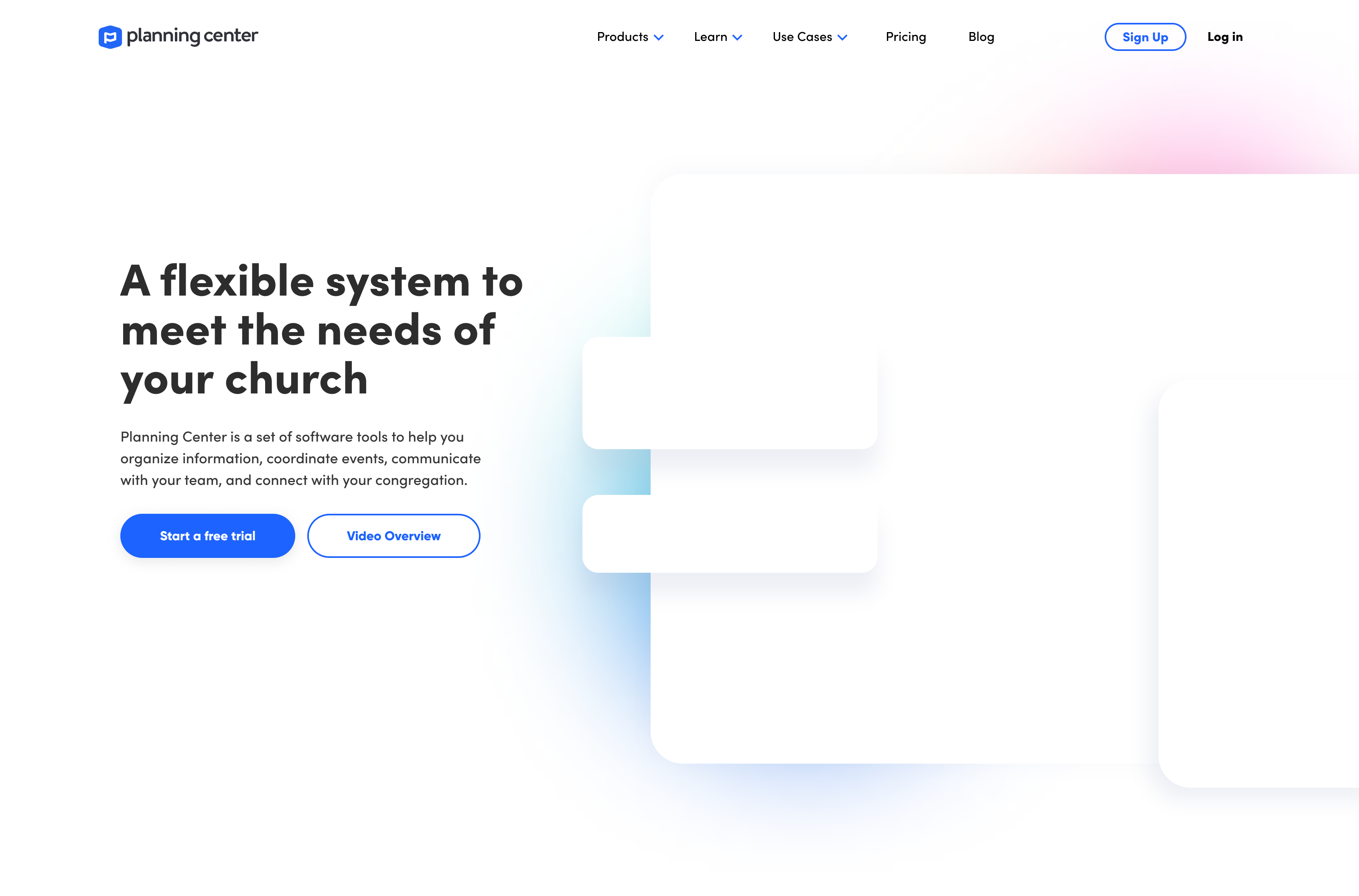
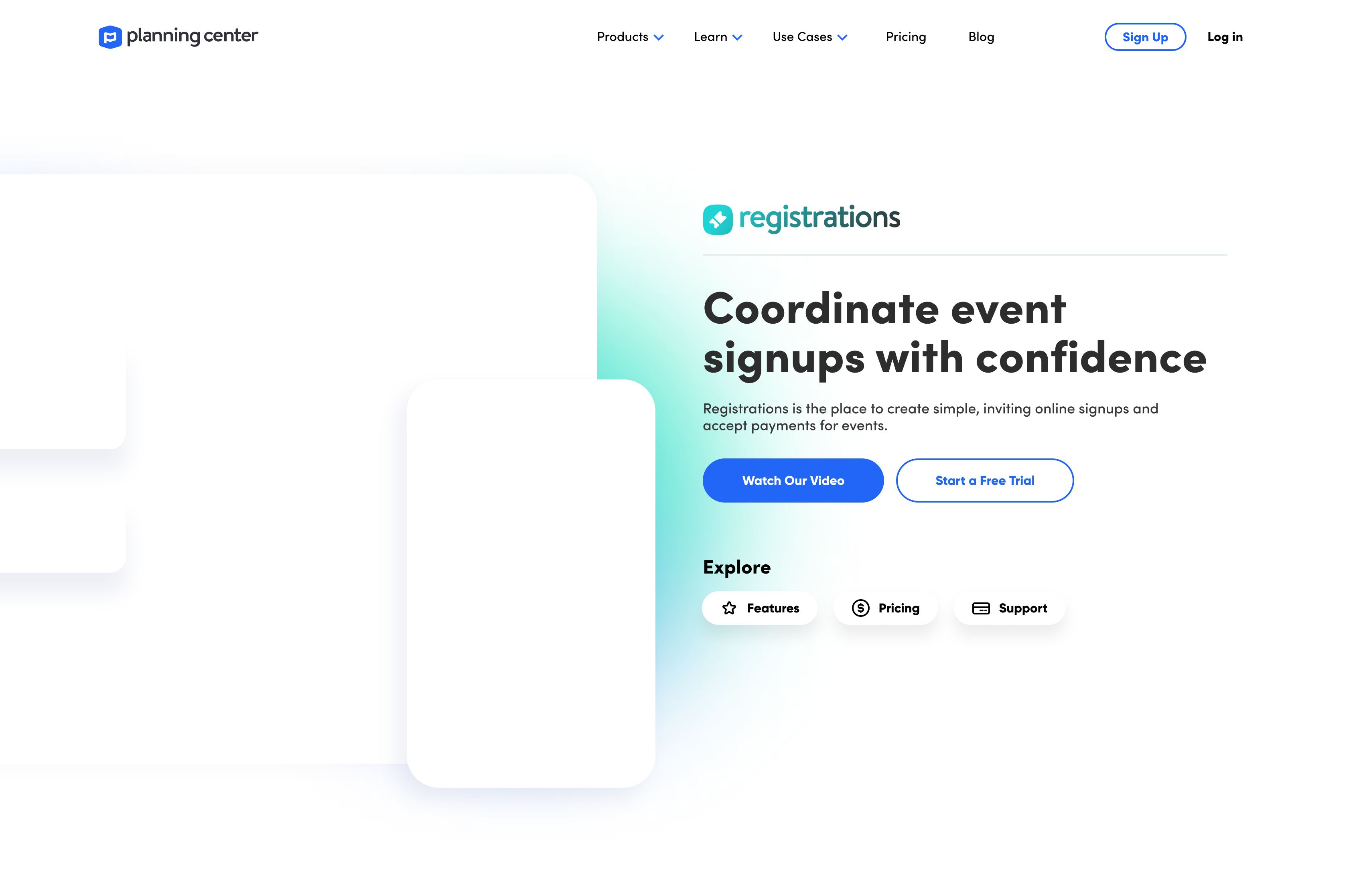
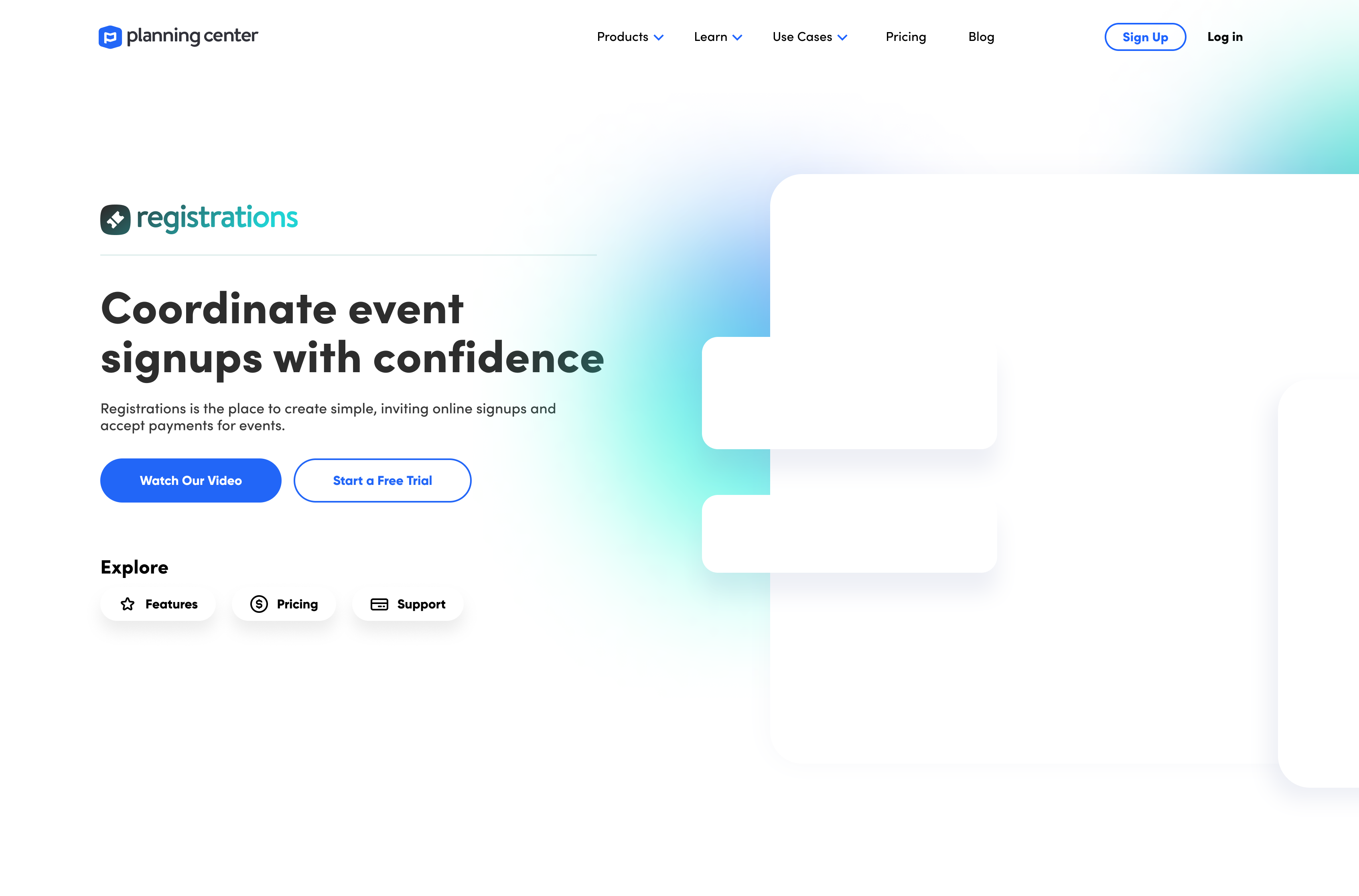
Some rough comps of how the final could look.
Implementation
Update 2024: It's cool to see that these ideas were implemented, some while I was still with Planning Center, and others after I left. I'm happy to know that this work was valued and taken to the next level by the team over there and I'm looking forward to what they do next. planningcenter.com