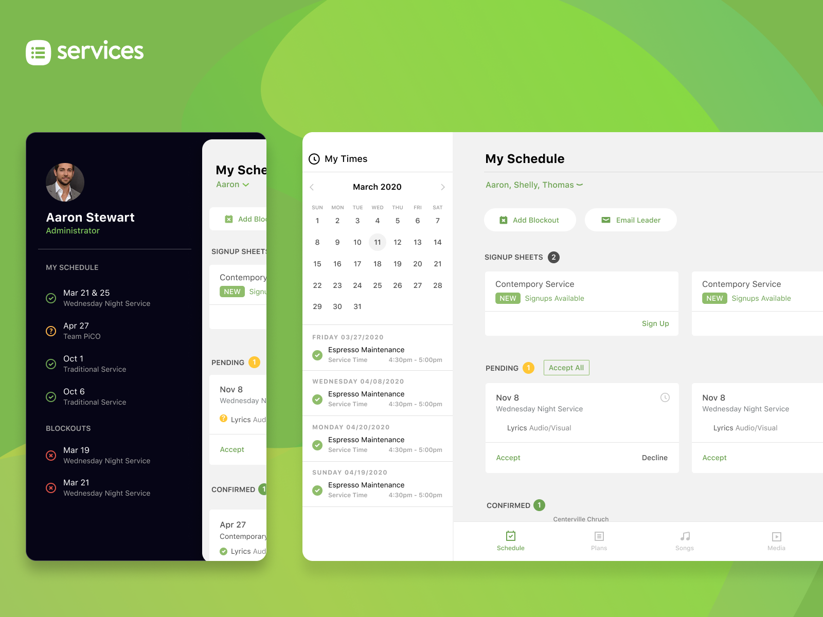
Planning Center - Services Mobile
apps & games
01/31/2012

I started working on the mobile app for Planning Center Services (formerly Planning Center Online) in 2011 when I was first hired. We were working backwards because the app was already built and in use on the web but the mobile app was very limited. There were little to no wireframes at the time for it so I went through building user flows and spent a lot of time doing that. We had the time to be able to invest in that and looking back I would have liked to refined that process a little more.
In 2018 I revamped the UI for the mobile app and defined the new approach which is still in use today. At first we were solely focused on iOS but then we expanded to Android eventually and learning about dpi in addition to the different practices Android uses was fun and educational.
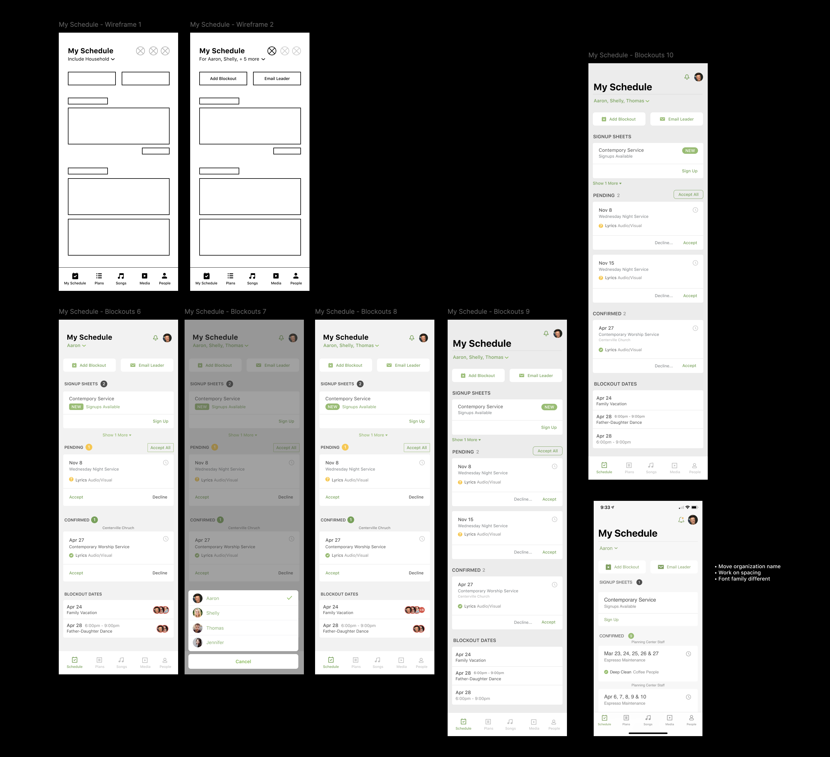
Example of UX
I typically work with basic shapes at first when it comes to layout for UX. I tend to avoid using copy. First, it's usually not ready and second because folks tend to start treating wireframes like comps when it comes to feedback if they look too specific in any regard.
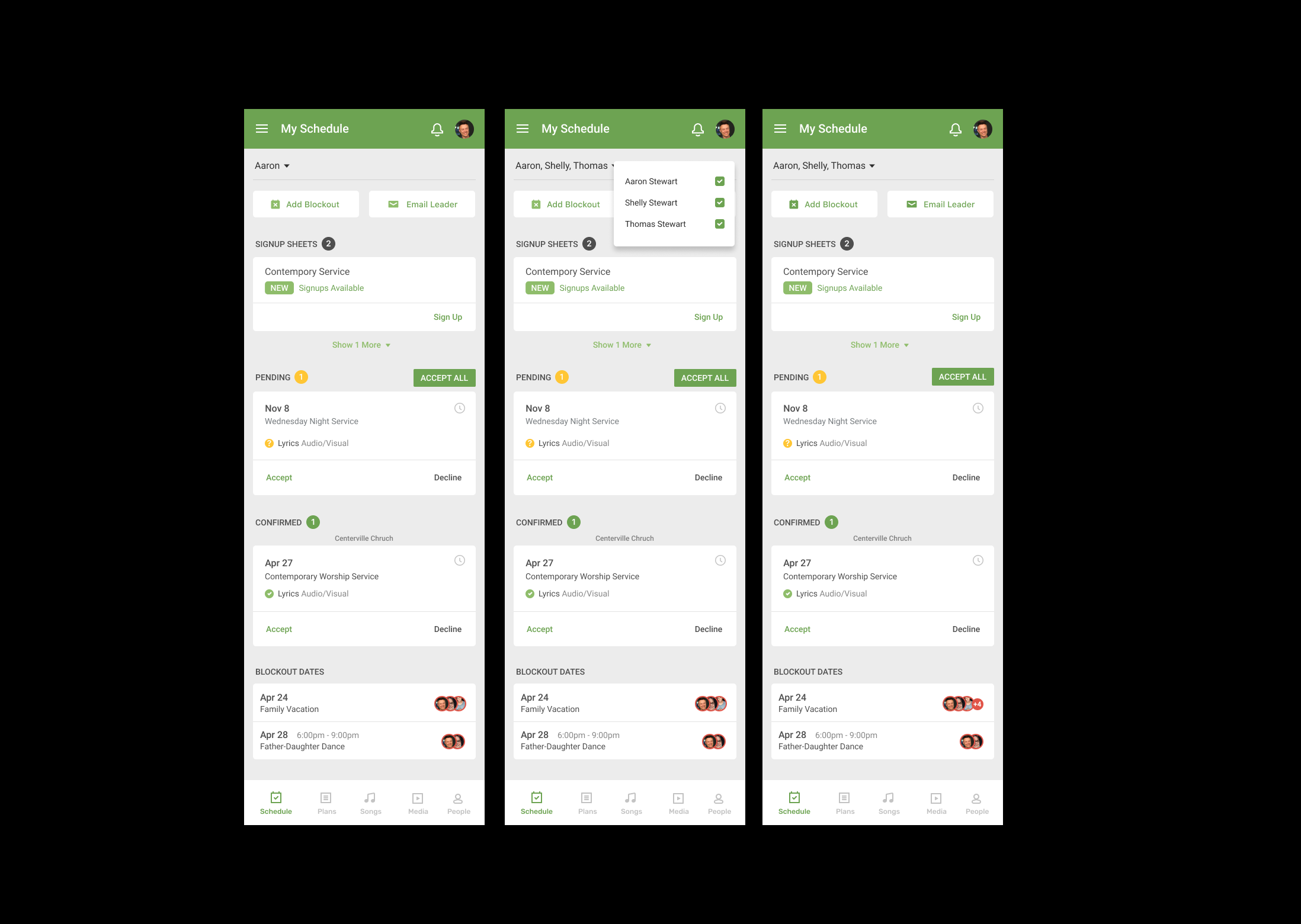
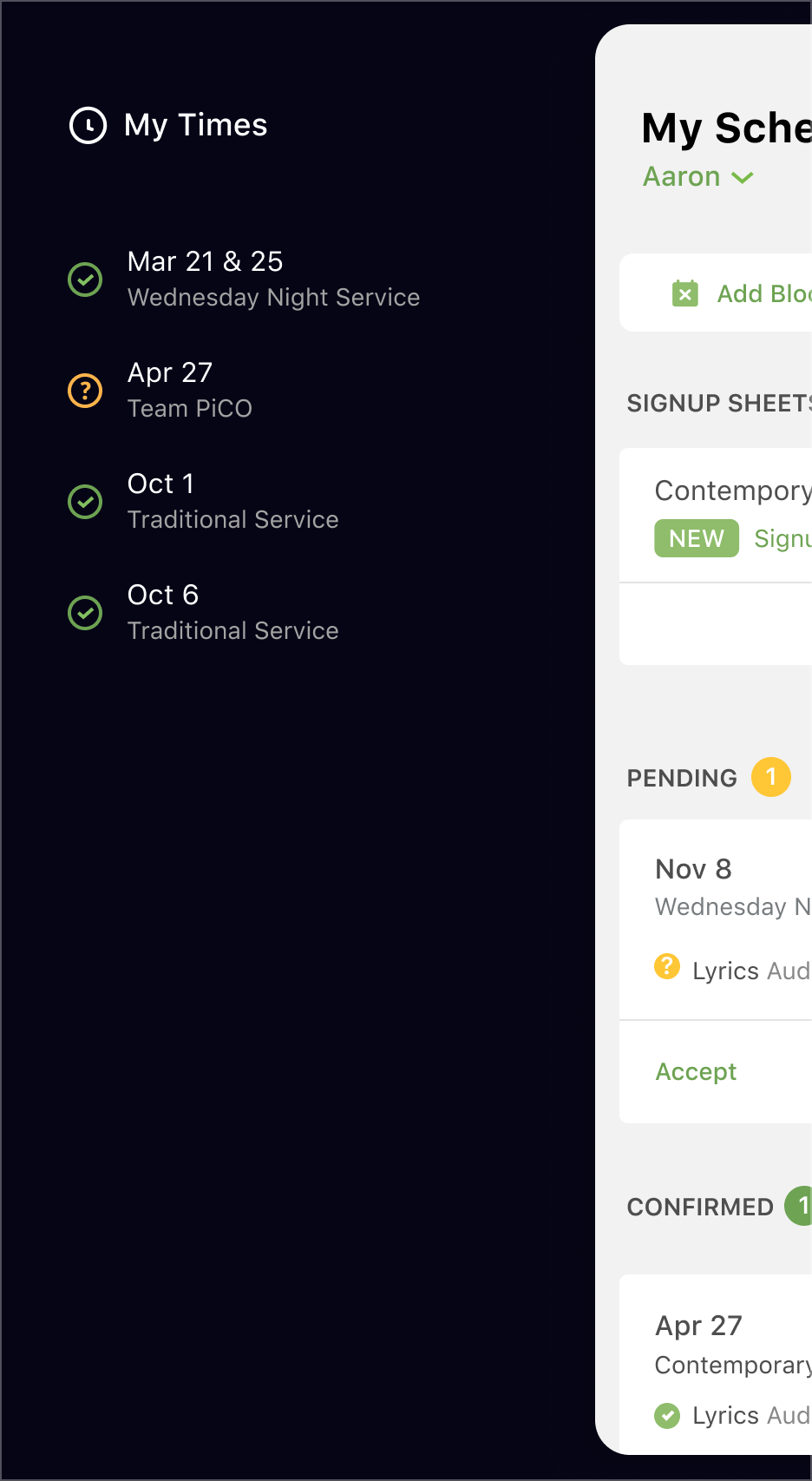
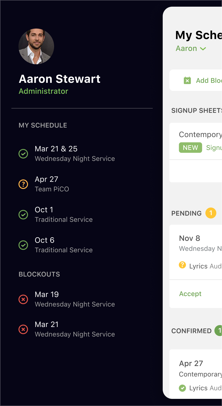
Phone Comps
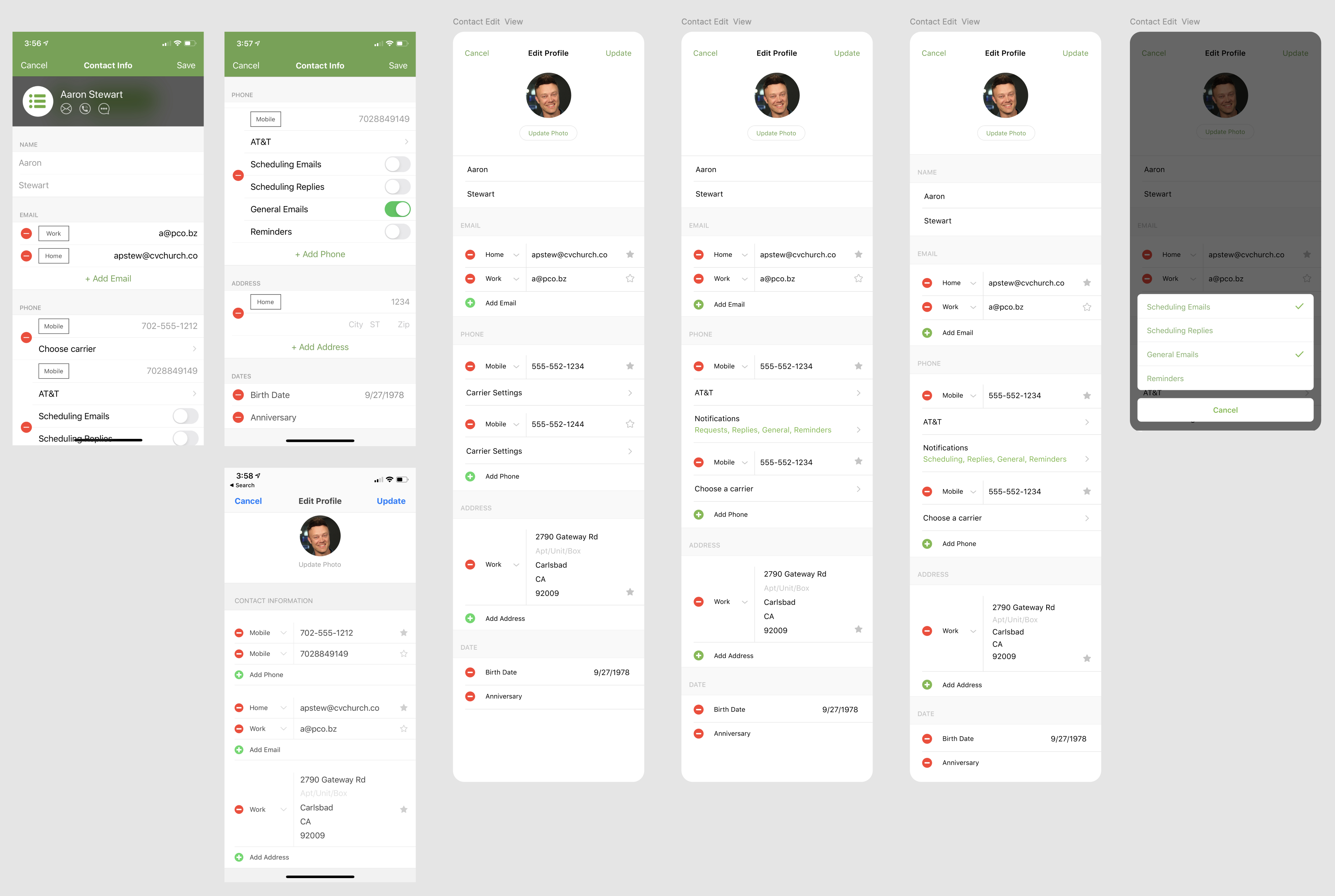
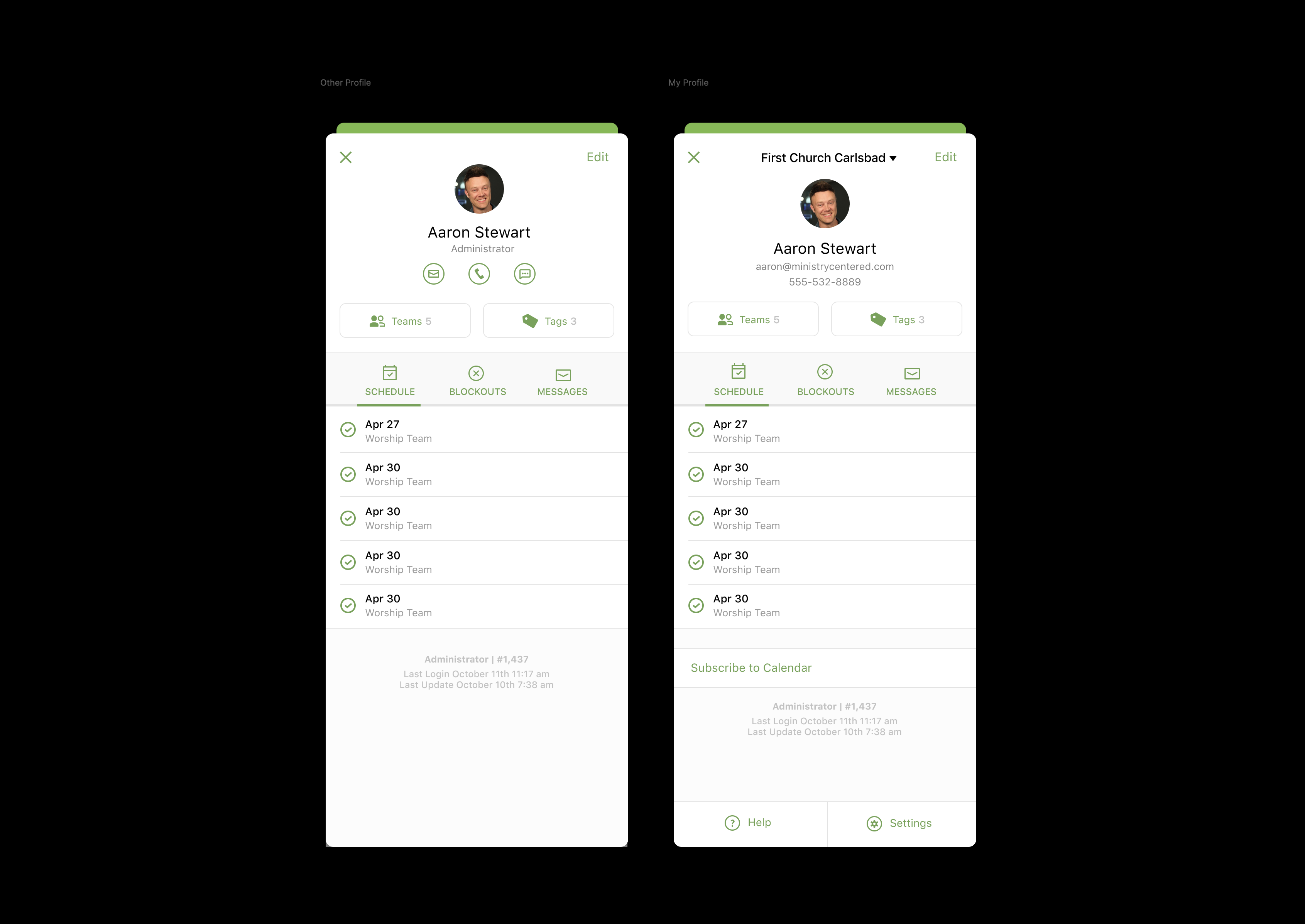
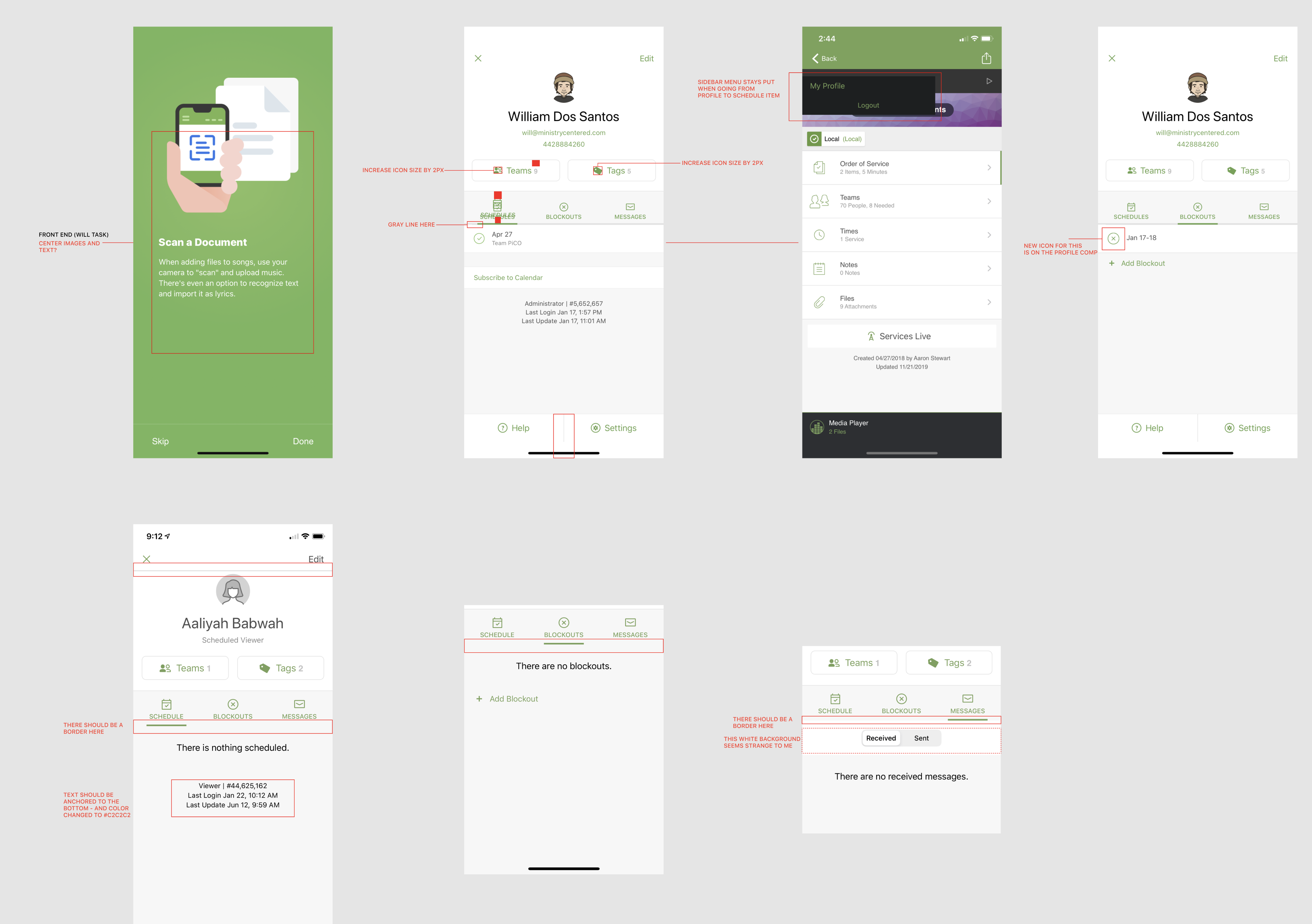
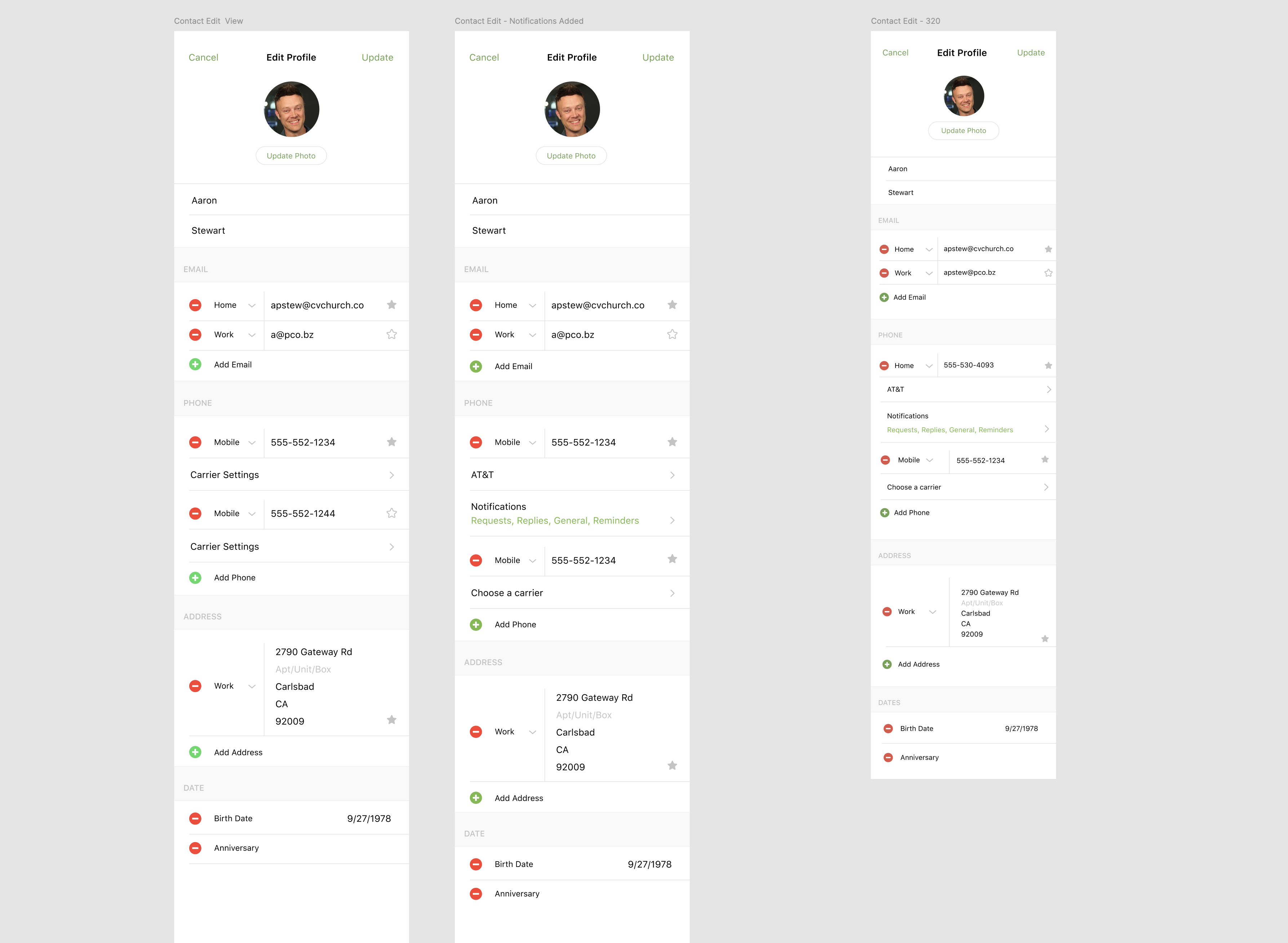
Phone Comps - Sidebar
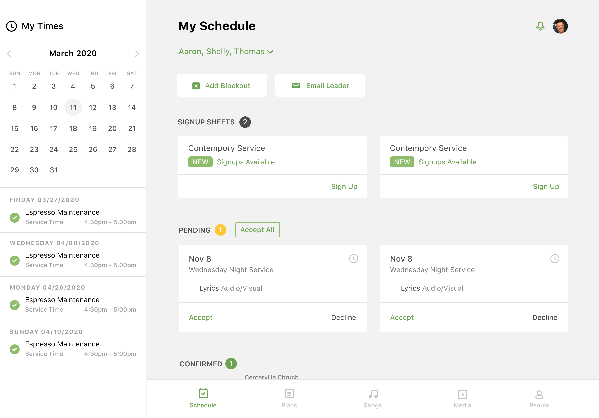
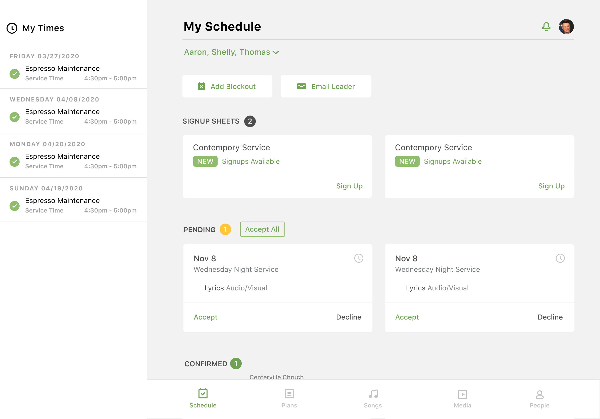
Personally, I'm a fan of the third concept here. I can't remember what we went with but the final result was pretty close to this. Really enjoyed working with Aaron Stewart on this. Can't say enough good things about that man.
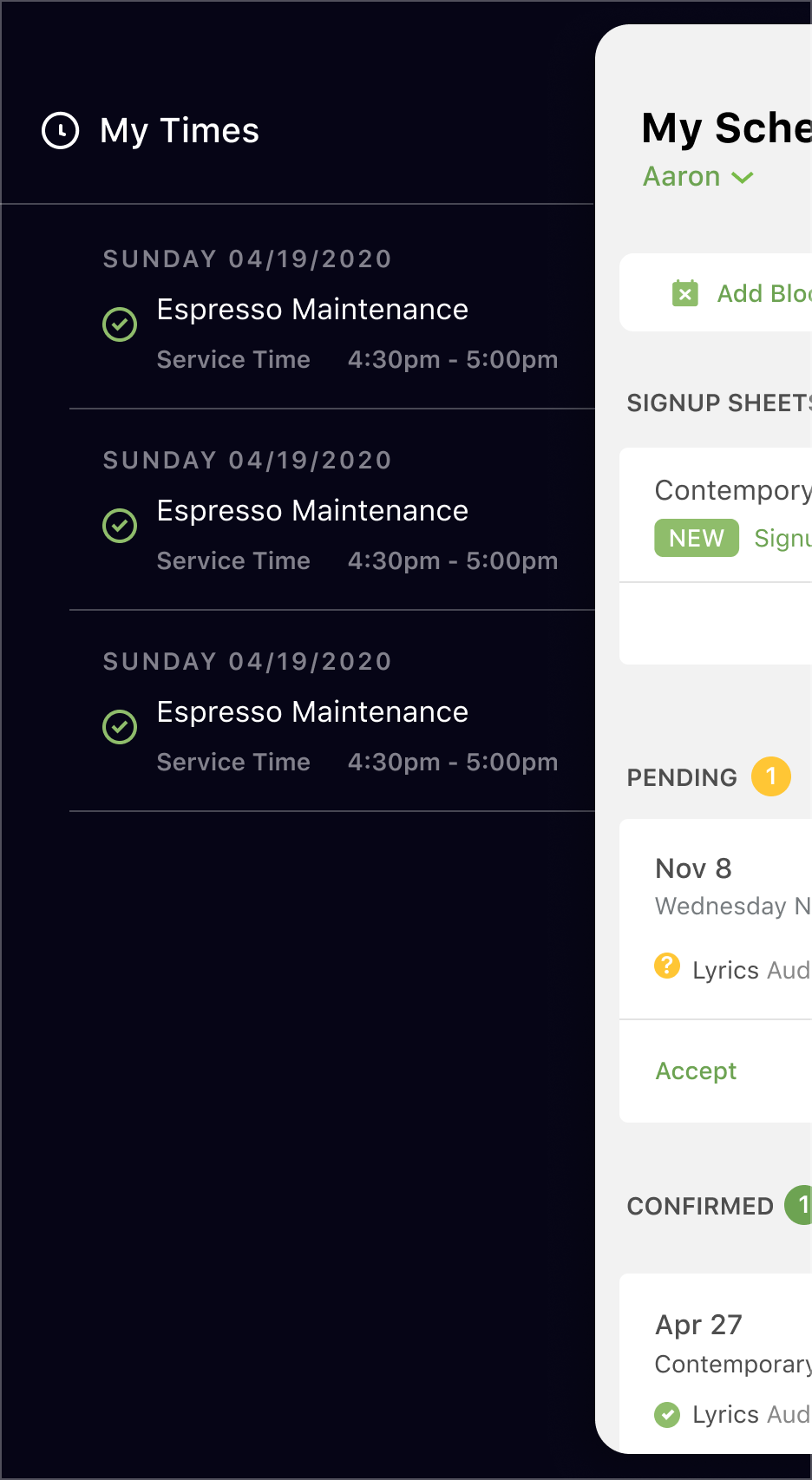
Tablet Comps
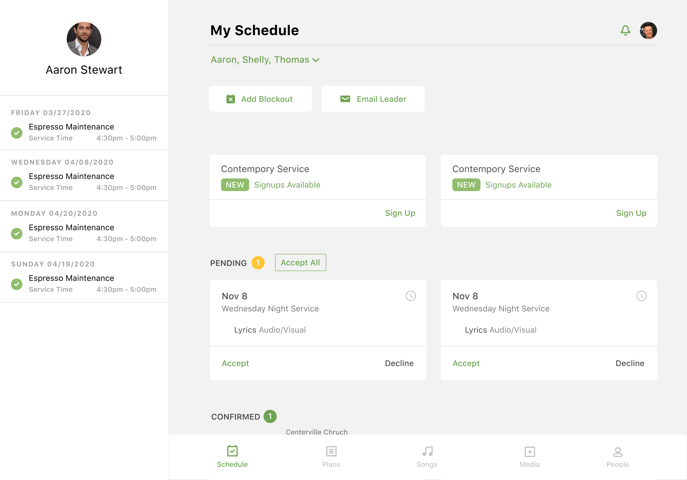
Final UI
